REBRANDING:
FIRST METHODIST HOUSTON
First Methodist Houston is Houston’s oldest church, and first moved into their current building downtown in 1890. It’s a building chock-full of history, from several one-of-a-kind stained glass pieces, to a century-old prayer rail rescued from fire, to the oldest operating elevator in the city. It’s a church that’s proud of who it is and who it’s been.
The Current Design
The problem was, when I arrived as a video editor in 2017, the graphic design for the church did not match the church’s aesthetic. The church’s logo looked like this:
And the artwork surrounding it matched it, unfortunately. I’m very sensitive to how difficult graphic design can be for understaffed churches who are doing the best they can, but this was a church that had two full-time graphic designers working for it, and this logo had been created in 2016.
A Chance To Start Again
When I became communications director in 2018, I had the chance to reinvent the some of what the church was doing. But I was limited in the scope I was allowed. The church had plastered the existing logo all over both of their campuses, and there wasn’t the money or desire to do any rebranding. Our task became one of making the existing design feel cleaner and more modern without upsetting the apple cart.
What’s more, I was working with the same design team that had created the original looks. So it was also a matter of winning the team over to the idea that a refresh was a good idea.
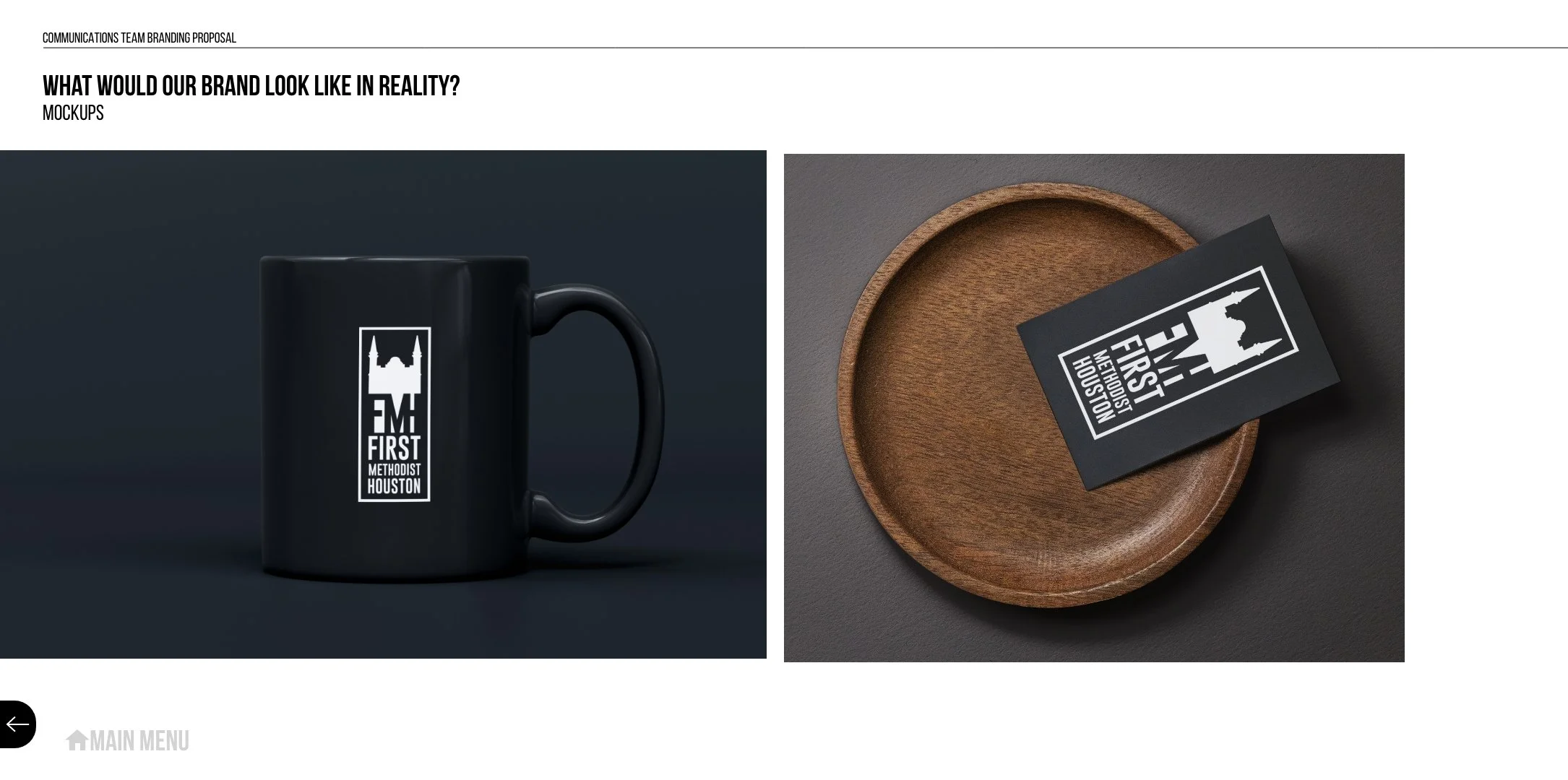
So, we simplified the design we had and made it much more flexible. Suddenly, we could put it onto anything.
We followed that up with moving all of our design work to sleeker, more modern designs, paired with work that showed personality and life. As a result, our team was finally given the go-ahead to create some new potential branding for the church.
Since we figured that we would only get one shot at this and our window of time was pretty small, we worked to put together a presentation with a variety of pitches, hoping that being able to see the varieties that were possible, enthusiasm for the idea from church leadership would surge.
Pitch 1: Cleaning Things Up
We made sure our first design was something simple, clean, and above all, flexible. Something where we didn’t just love the design, but were able to show how the design would work in all different facets across both campuses.
Pitch 2: Traditional Design, Unconventional Formatting
We wanted our next pitch to feel significantly different from the first pitch, so that the series didn’t just feel like shades of the same concept.
For this one, we focused on our bell tower, and the symbol it is within the city.
Pitch 3: Simple, Modern, and Clean
After heavily leaning on the iconography of the church, we wanted a pitch that felt the complete opposite - something that felt much fresher, that could stand on its own as a symbol, that could live on a tee shirt or a sign or a sticker, something that could be ubiquitous without ever wearing out its welcome.
Pitch 4: The Church As Symbol
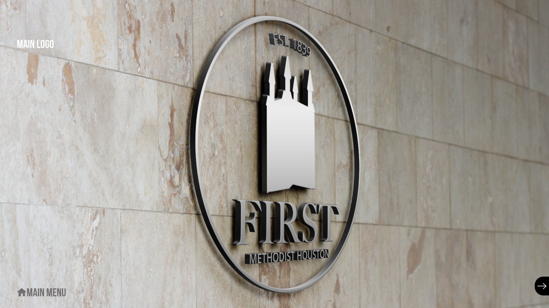
Once again, we zagged away from the previous pitch to go back to something much more traditional. This time, we really centered the bell tower as a traditional symbol - but encased in a circle, like a stamp, a blend of old design and new trends.
Pitch 5: The Stained Glass
The center of First Methodist Houston’s identity as a worshiping community is their historic downtown chapel, featuring giant pieces of stained glass art, many of them entirely unique to the church.
So we designed a logo around that identity:
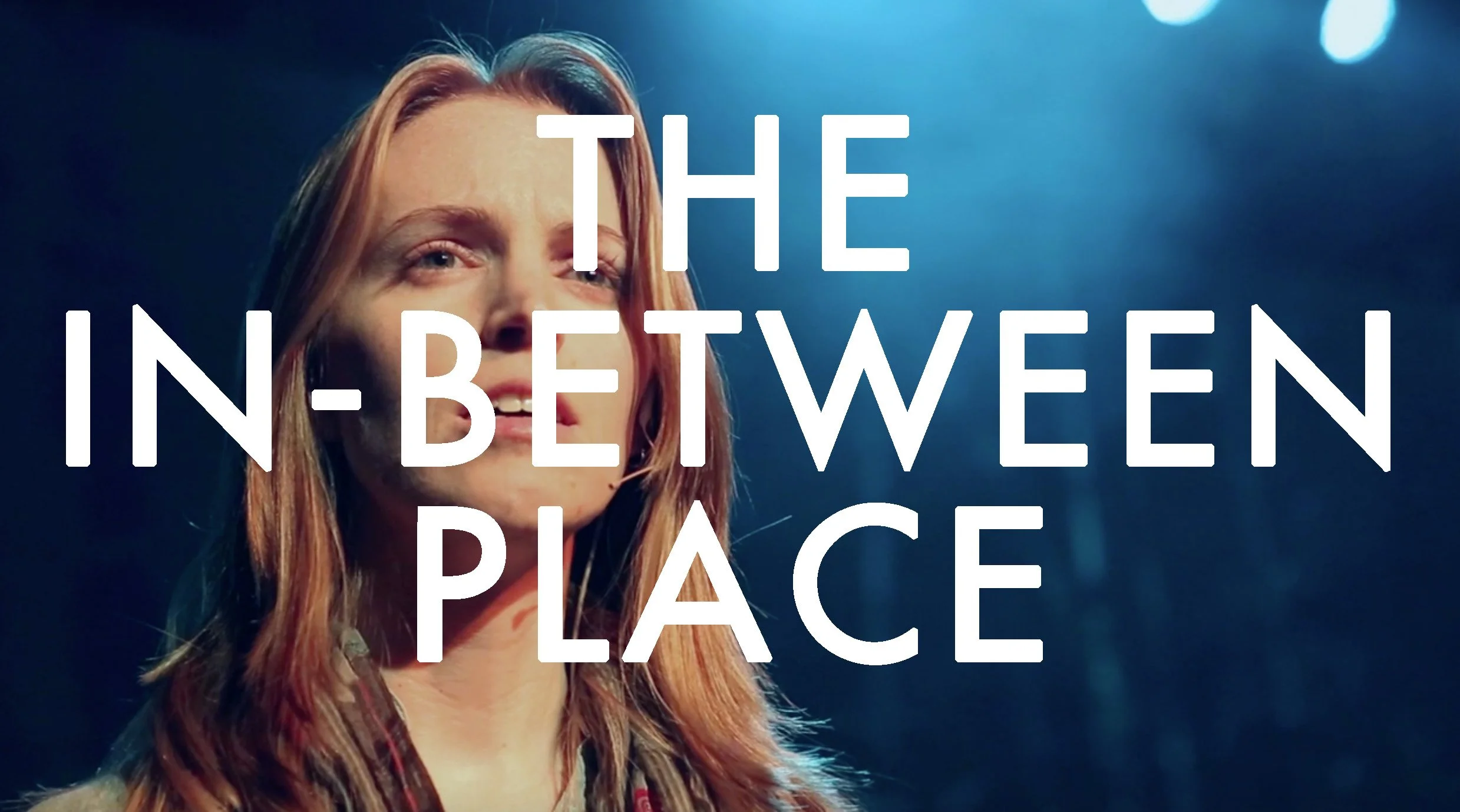
THE IN-BETWEEN PLACE
"PART II"
Good Friday is a big deal at The Woodlands UMC. Back in the days where Chris Tomlin was their worship leader, they would hold services at the 16,000-seat Woodlands Pavilion. The year I started was the first year they moved the night back to campus and tried to recreate the same magic. For the first several years years they'd bring in big worship leaders and build massive stages outdoors, with mixed results.
Eventually, we built an actual worship team to plan the event, and we decided to make the service less about a being a big event and more about being a distinct and focused night of worship. We'd build the service thematically around an idea, then produce the best possible service we could around that concept.
This year's theme was "The In-Between Place" - that is, the moment in between Christ's sacrifice and resurrection, the long pause before the dawn breaks clear on the horizon and you know the joy of Christ’s return. We wanted it to be poetic and haunting, and my boss just pointed at me and said "go write this."
Since I do not write poetry, this was a bit of a risk, but I loved getting the chance to play with this idea and try to create something, between the words and the filmed images, that conveyed what waiting for a Savior meant.
This is the finished film, with a recording of a rehearsal with the narrator (Emily Hudson) laid over the top.
Now, here is the live performance of the piece. There were actually three pieces to this - a section read aloud outside, as the cross was brought in through the crowds to the sanctuary, this section midway through worship, and a wordless section that closed out the night.
I've worked with Emily in a dozen different projects, and I love doing so because she always brings her whole self into everything that she does. Everyone else in the project wanted to find someone loud and booming to do this part. I wanted Emily, and what she brought to this performance is why.
THE FIRST COVID CHRISTMAS
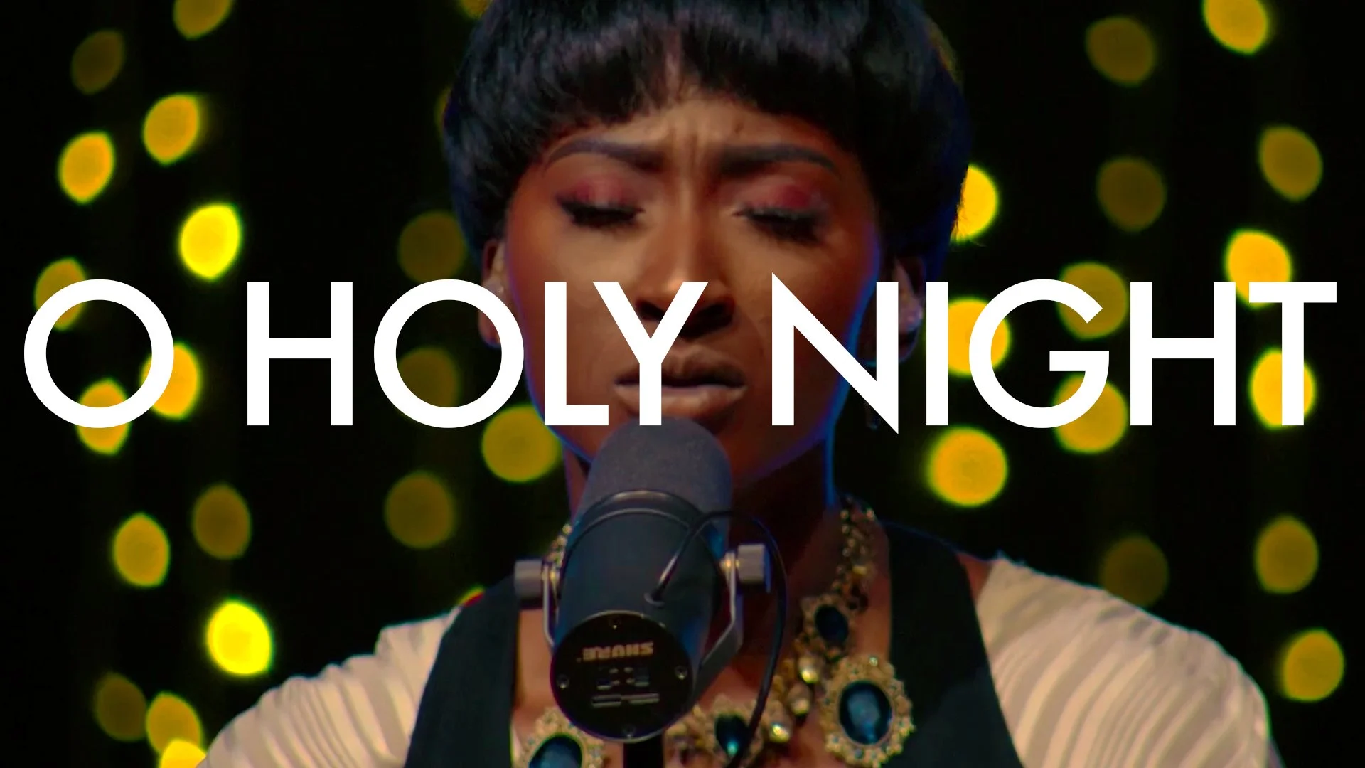
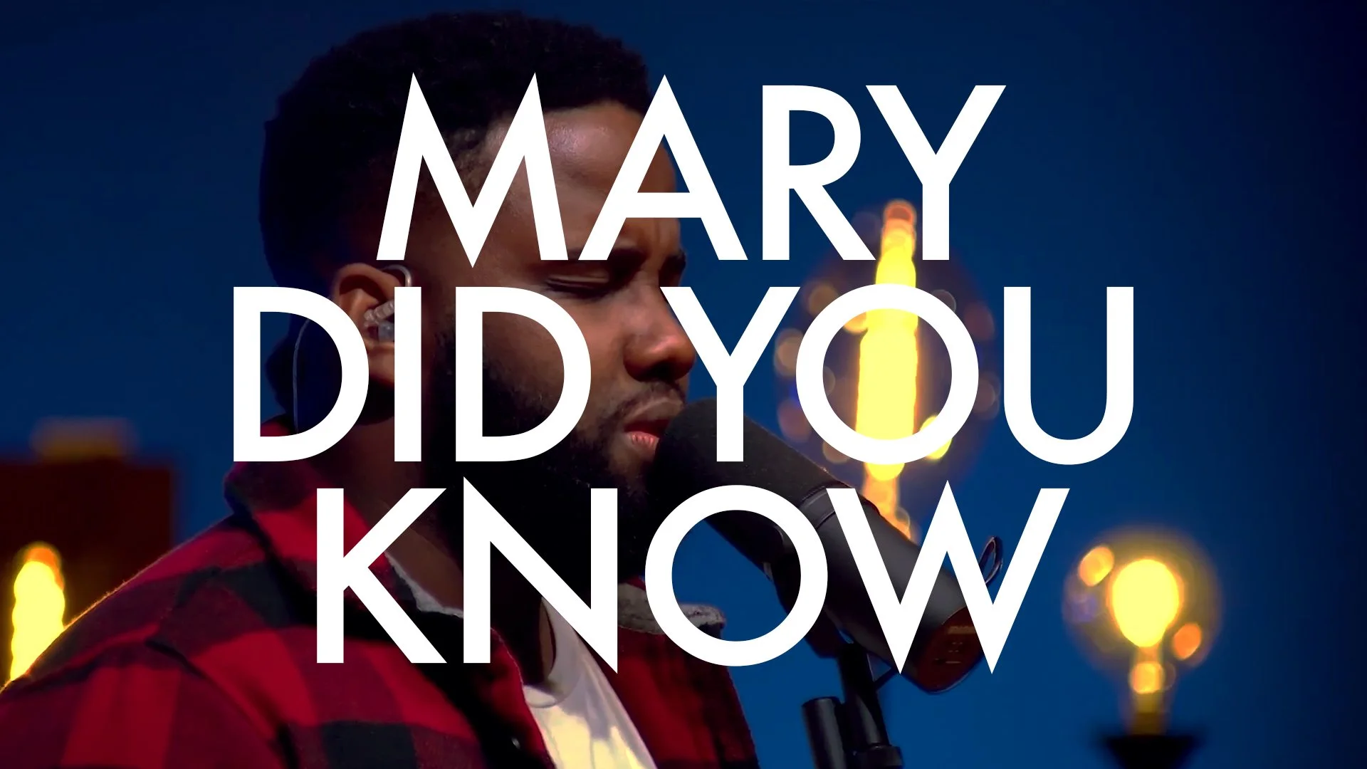
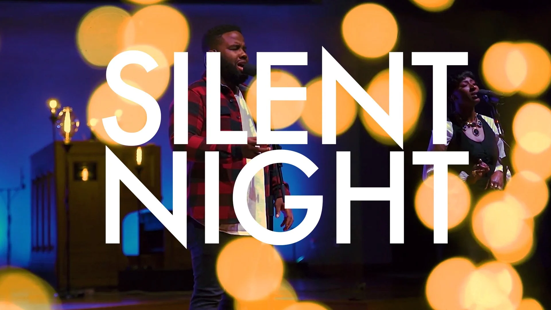
People were understandably depressed when we got to Christmas 2020 and we still weren’t able to worship in person. We are a church of tradition, and filling the sanctuary and singing “Silent Night” while holding candles on Christmas Eve is a sacred moment for everyone. You can watch a service and light candles at home, but it’s not the same.
But even though it was going to be different, I still wanted it to be special.
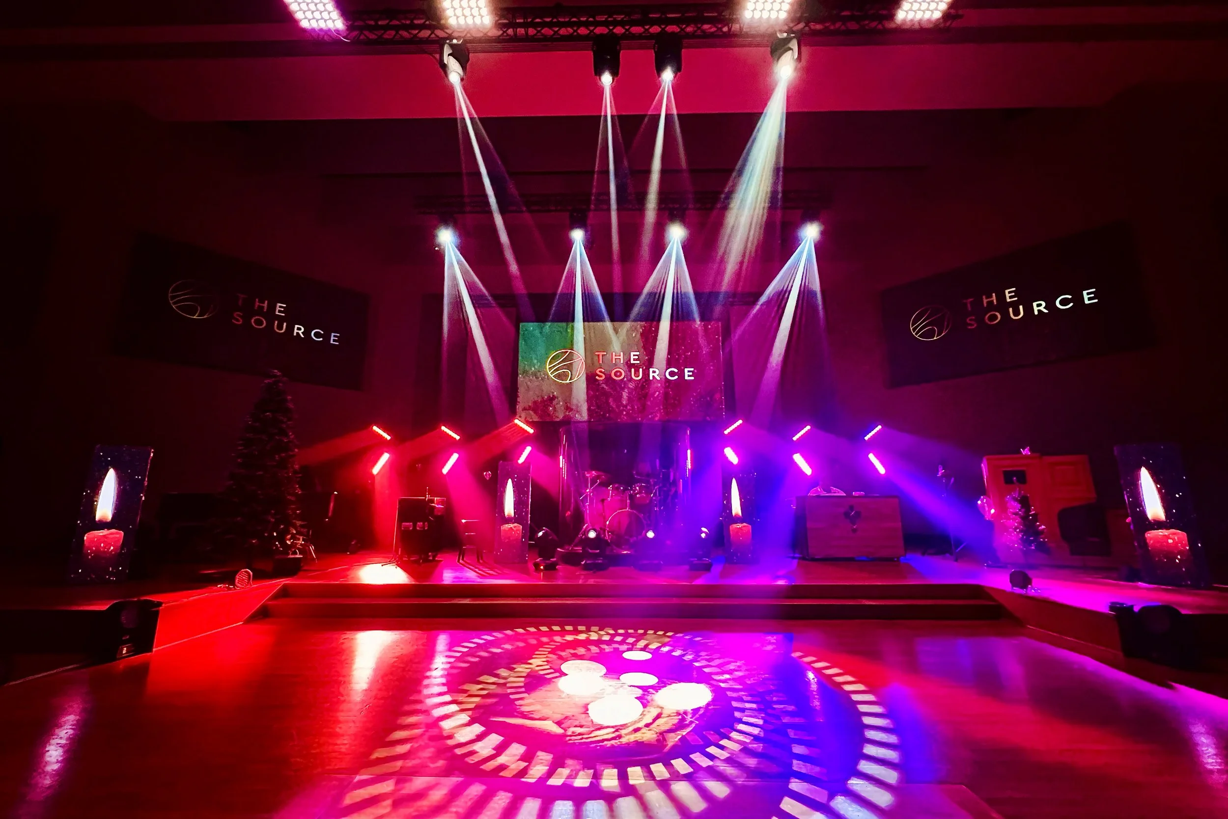
We wanted to mix some Christmas songs into weekly worship, so I set out to design a set that would be as transportive as possible.
But it was Christmas Eve I really had my eye on. We were still shooting all of our music inside an empty sanctuary and multi-use rehearsal spaces, and with no one in the buildings, we had cut every bit of Christmas decoration out of the budget. How could we make it feel like Christmas was really happening?
I gathered up every bit of Christmas decoration I could from forgotten closets on both campuses and drove all of it out to the rehearsal space. My very understanding wife came along to help:
Then my team and I got to work setting it all up.
We spent the better part of two days preparing, then filmed the Christmas special all in a couple of hours. It felt like magic.
Everything we recorded is below:
